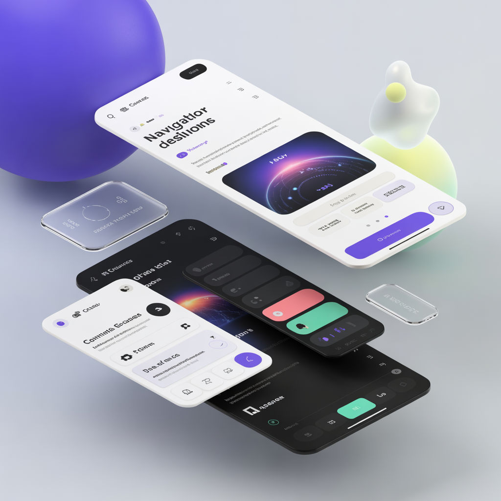
Why standard layouts are losing effectiveness
The classic top nav + hero works for simple marketing pages, but it struggles with:
- large product suites
- deep documentation
- complex dashboards
- multi-role user experiences
Navigation should reflect user intent, not company org charts.
Pattern 1: Command palette navigation
Best for:
- power users
- internal tools
- apps with many destinations
Key design rules:
- searchable labels
- keyboard-first access
- recent items + favorites
- clear grouping (Projects, Settings, Reports)
Pattern 2: Contextual sidebars
Instead of one mega sidebar, use a sidebar that changes with the current section (Docs, Billing, Admin). This reduces cognitive load and helps users build a mental map.
Pattern 3: Bento-style entry points
Great for product suites and landing pages where users have multiple valid starting paths. Each tile represents a user goal, not a feature list.
Pattern 4: Scrollytelling for narrative content
Best for:
- case studies
- product storytelling
- data-driven reports
Be careful:
- keep content accessible
- don’t block scroll
- support reduced motion
A practical selection guide
- If users frequently jump between features: command palette
- If users work within one area at a time: contextual sidebar
- If users are deciding what to do first: bento grid
- If you’re persuading or explaining: scrollytelling
Navigation checklist
- Labels match user language (not internal jargon)
- Keyboard navigation works end-to-end
- Mobile nav is intentionally designed, not compressed desktop nav
- Information architecture tested with real tasks