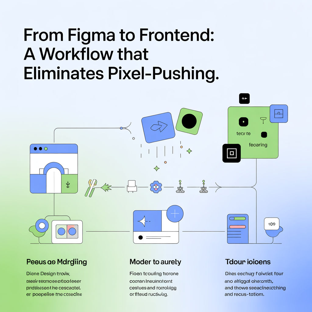
The real goal: shared intent, not perfect screenshots
Handoff fails when designs don’t specify behavior. A strong workflow defines:
- layout rules
- responsive behavior
- states (hover, focus, error, empty)
- content constraints (long titles, translations)
In Figma: structure for implementation
- Use Auto Layout everywhere possible.
- Components should map to real UI components (Button, Input, Card).
- Name variants clearly:
Button / Primary / Small, etc.
Define responsive rules explicitly
For each component/page, specify:
- What grows and what stays fixed
- Min/max widths
- Wrap behavior
- Alignment rules
Example annotation template
- Container padding: 16px mobile, 24px desktop
- Card: image fixed ratio, content flexible
- Title: 2 lines max, then ellipsis
- CTA: sticks to bottom of card
In code: stop hardcoding and start tokenizing
- Use spacing and typography tokens (even if minimal).
- Avoid “magic numbers” unless documented.
- Build layout with flex/grid rules that mirror Auto Layout.
Prevent “design drift”
- Add Storybook (or similar) pages that designers can review.
- Capture visual snapshots for key components.
- Maintain a small set of “golden paths” (checkout, sign-up, PDP).
Workflow checklist
- Every component has variants + states in design
- Responsive behavior documented (not assumed)
- Content edge cases included (long text, empty)
- Devs have reusable components, not one-off copies